Getting started with Matplotlib
Contents
2.5. Getting started with Matplotlib#
In this section we are going to get started with drawing plots from lists using the matplotlib package.
matplotlib is the most widely used package for visualising data in Python 1.
2.5.1. Importing Matplotlib#
As with NumPy, matplotlib should also be present in the conda environment setup for these practicals.
To import matplotlib in your code use the following code:
import matplotlib.pyplot as plt
2.5.2. Drawing our first plot#
Let us start by drawing a simple line plot:
import matplotlib.pyplot as plt

# values of x and y points
x = [1, 2, 3, 4, 5]
y = [2, 3, 4, 5, 6]

plt.plot(x, y)
plt.xlabel("x-axis")
plt.ylabel("y-axis")
plt.show()
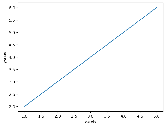
In the code above, x and y represent the coordinates to plot on our plot. The plot() function takes as an argument
the x and y coordinates to plot (see documentation).
plt.xlabel() sets the title of the x-axis label, and similarly plt.ylabel() sets the title of the y-axis label.
Calling plt.plot(x,y) on its own will not plot the plot for us. To visualise the plot we need to call the plt.show() function.
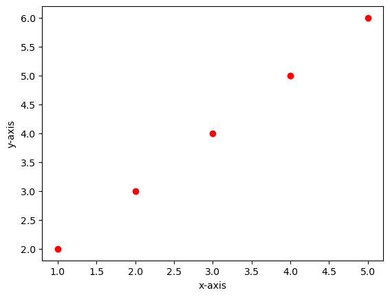
You can also use plt.plot() to plot markers on the plot. To do this you need to use the fmt parameter
that takes as an input a format string that specifies the type of marker you want to plot. The syntax of the format string
originates from MATLAB which concatenates a colour string with a line style string. The code below shows an example of plotting
the same (x,y) coordinates in the previous plot but this time using red circle markers:
import matplotlib.pyplot as plt

x = [2, 3, 4, 5, 6]
y = [1, 2, 3, 4, 5]

plt.plot(y, x, "ro")
plt.xlabel("x-axis")
plt.ylabel("y-axis")
plt.show()
There is a vast list of string formats you can specify that generate different markers. A whole list of format strings supported can be found here at the bottom of the page in the Notes section.
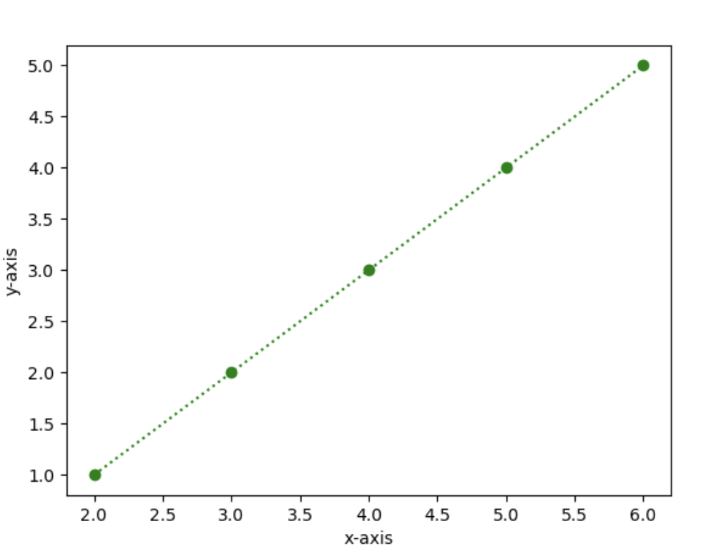
Exercise 2.10 (Draw dotted line plot with markers)
Level:
x = [2, 3, 4, 5, 6]
y = [1, 2, 3, 4, 5]
Using the x and y coordinates above, draw a plot with green circle markers joined together with a dashed line as shown below. The plot should
look like this:
plt.plot() is only used to plot x and y coordinates as lines or markers. If you want to plot something else, you need to use
a different plot. You can see a list of the different plots supported in Matplotlib here.
Exercise 2.11 (Plotting a scatter plot)
Level:
Generate 20 random numbers from 0 to 1, and set these as your x and y values. Plot these on a scatter plot.
This section was a gentle introduction, we will be plotting more with Matplotlib in next week’s practical.