Visualising data with Matplotlib
Contents
3.3. Visualising data with Matplotlib#
Now that we have learned how to slice our data let us start visualising it. We have already seen previously
how to plot simple plots. Here we will be looking at more examples of how to visualise data with matplotlib.
3.3.1. Visualising Pandas data structures in Matplotlib#
The authors of Matplotlib recommend that NumPy arrays are used as an input to Matplotlib functions. They also mention that if Pandas data structures are used, it might not work as intended and therefore recommend to convert these to NumPy arrays before plotting 1.
Let us start by plotting one of the columns from our DataFrame as a line plot:
import pandas as pd
import matplotlib.pyplot as plt

# read data from file to DataFrame
df = pd.read_csv("data/world-bank-1_data.csv")

#plot life expectancy
df["life_expectancy_t"].plot()
plt.show()
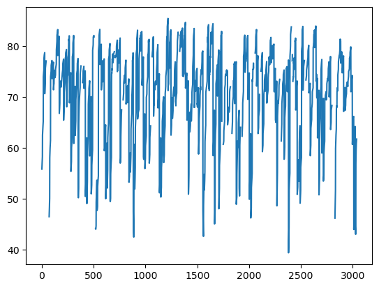
The plot() method from Pandas provides us with an efficient way of plotting Pandas data using Matplotlib functionality.
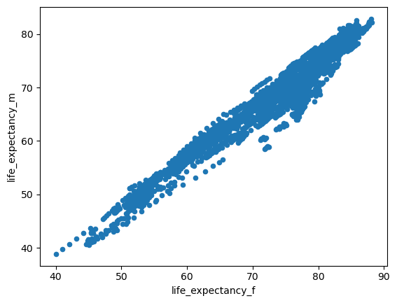
The same process can be used to plot different kinds of plot in Pandas. Below are a few examples.
# scatter plot
df.plot.scatter(x="life_expectancy_f", y ="life_expectancy_m")
plt.show()
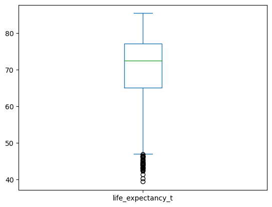
# box plot
df.plot.box(column="life_expectancy_t")
plt.show()
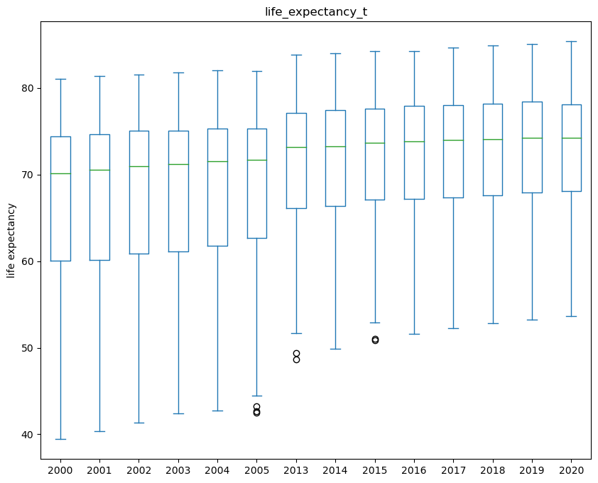
If you have categorical data in your dataset, and you want to create individual boxplots for each category you can do this via
the by argument of the plot.box() method. Below is an example. To find out more wha
df.plot.box(by="year", column="life_expectancy_t", figsize=(10,8), xlabel="years", ylabel="life expectancy")
plt.show()
3.3.2. Saving image to file#
To save a plot to an image file use the savefig() function from matplotlib.pyplot. Create a folder output in your PyCharm project. We want to save the
plot in this output folder.
df.plot.box(by="year", column="life_expectancy_t", figsize=(10,8), xlabel="years", ylabel="life expectancy")
plt.savefig("output/boxplot.jpg")

Now go into the output folder and see if the image is there!
Exercise 3.6 (Drawing plots with Pandas data)
Level:
In the code used in this section we have mainly looked at plotting life expectancy.
Practice by running the code above.
Plot the same plots but this time use the column
co2_emissions_pcas the main variable in the plots
Exercise 3.7 (Highlighting selected points)
Level:
Create a scatter plot with life expactancy on the x-axis and co2 emissions on the y-axis. Highlight the points where co2_emissions are greater than 40 in red.
Hint: Use the plt.subplots() to create a figure and only one subplot.